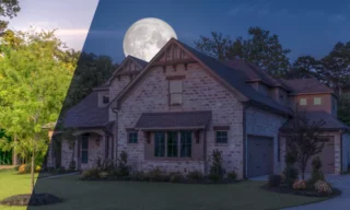
Convert Architectural Photos to Draft / Sketch Drawing in Photoshop
Photoshop offers a plethora of tools and techniques for creative photo editing. In this tutorial, we’ll explore a quick and effective method to transform architectural images into draft-like sketches. This technique is perfect for architects, designers, or anyone interested in adding a unique, artistic touch to their architectural photographs.
Understanding the Basics
Before diving into the process, it’s crucial to ensure that the photos you’re working with are converted into smart objects.
This allows for non-destructive editing, meaning you can modify the photo without permanently altering the original image. To convert a layer into a smart object, simply right-click on the layer in the layers panel and select “Convert to Smart Object.”
Creating the Draft Effect
The first step involves defining the contours of the image. This is done by using the filter menu: Filter > Stylize > Find Edges. This action highlights the outlines of the architectural elements in the photo, laying the groundwork for the sketch-like appearance.
Drafts are typically monochromatic. To achieve this look, convert the colored areas of the photo to black and white. This can be easily done by clicking on the Adjustment button and selecting the Black and White option. This step removes the colors, leaving you with a grayscale image.
To enhance the sketchy feel, add a paper texture background. You can find various paper textures online. Once you’ve chosen one, change its blend mode to Multiply. This blend mode allows the dark areas of the underlying layer to show through, mimicking the look of a drawing on paper.
If the paper texture is too dark or too light, you can adjust its appearance using Levels or Brightness and Contrast from the adjustment options. This step allows you to fine-tune the texture to your liking.
Adding Color
Now, let’s introduce some color to the image. A light blue is a great choice for a subtle, aesthetic touch. After selecting your color, you can adjust its intensity and blend mode. Changing the blend mode to Screen and reducing the opacity (e.g., to 50% or 25%) can give a more natural, pencil-like appearance.
As a final step, add a Brightness and Contrast adjustment to slightly increase the contrast. This step is subjective and depends on the specific texture of your paper background and the architectural photo you’re working with. Adjust according to what looks best to your eye.
Applying the Technique to Another Image
Now that you’ve mastered the technique with one photo, you can easily apply it to others. Since the steps are essentially the same, the process becomes faster with each additional image. Experiment with different textures, levels of brightness, and color intensities to see how they affect the final outcome.
Conclusion
In conclusion, transforming architectural images into drafts in Photoshop is a straightforward process that can yield stunning results. By following these steps and experimenting with different adjustments, you can create unique, sketch-like representations of architectural photos.